Colorama: designing a 1960s instrument dial for a Garmin watch
Colorama started in a folder of photographs of 1960s dive watches, the kind that prints a diver's decompression tables straight onto the dial, ring after ring of numbers. A Mido Ocean Star Decompression Timer, a Heron Retro-Scale, a Delma Shell Star, an Ocean Crawler Core Diver. They are some of the busiest watch faces ever made that still work at a glance.
The reference
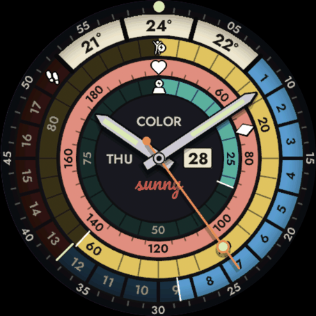
What those dials have in common is a short list. Rotated numerals around every ring. Real watch hands. Number labels printed on the rings themselves, not in a legend. Several values on the same ring, the way a depth scale prints metres and feet together. And a material feel, printed ink on lacquer under glass, rather than flat vector shapes.
The idea was to keep all of that and change only the subject. Same printed scales and rotated numbers, but plotting the wearer instead of dive tables. Steps, Body Battery, heart rate, stress.
Four concepts, three rejected
The first round was four different takes, all generated from one script and all carrying the same sample state so they could be compared: 10:38 on a Friday, 8420 steps, Body Battery 62, heart rate 72, 21 degrees.
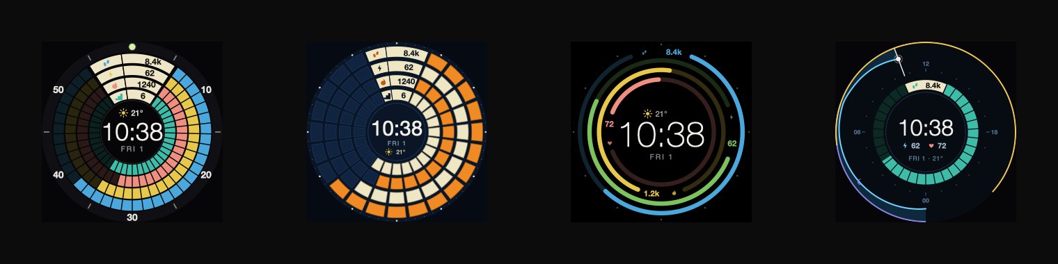
A was a stack of candy-coloured gauge rings in the Mido idiom. B was one web of trapezoid cells, cream and orange on navy like the Core Diver. C was four thin arcs floating on an open dial. D drew the day as a dive profile.
What I wrote in the notes that day: the round as a whole "missed the point of the references". C was "the cleanest of the four", and I told myself to remember it, but it was "a different aesthetic than the brief", so it went into the folder as a possible separate face and none of it was carried forward. A, B and D were dropped outright. None of the four had a rotated numeral, a real hand or a printed scale on it.
The dial appears
Round two was a single layout, drawn as faithfully to the references as I could manage, in two colourways: candy on black, which became Midnight, and cream and orange on navy, which became Harbor.
The hands are steel sword and baton polygons with lume inserts and thick dark outlines, and the seconds hand is a coloured lollipop. Steps take the wide outer band, 18 cells at a thousand steps each, numbered all the way round with the numerals flipped in the bottom half. Cells 13 to 18 are the red over-goal sector, with a lume line marking the goal. The forecast fan at 12 is the metres and feet trick: three columns, each carrying two values. Body Battery is a printed 0 to 100 scale that fills clockwise. Heart rate is a bright printed 40 to 180 scale read by a lume diamond, a pointer that never fills, the way a real instrument marks a value on a printed band. Calories took a 25/50/75 ring in the middle.
Then a material pass over all of it: lacquer gradient, grain, a vignette at the rim, groove lines between the rings.
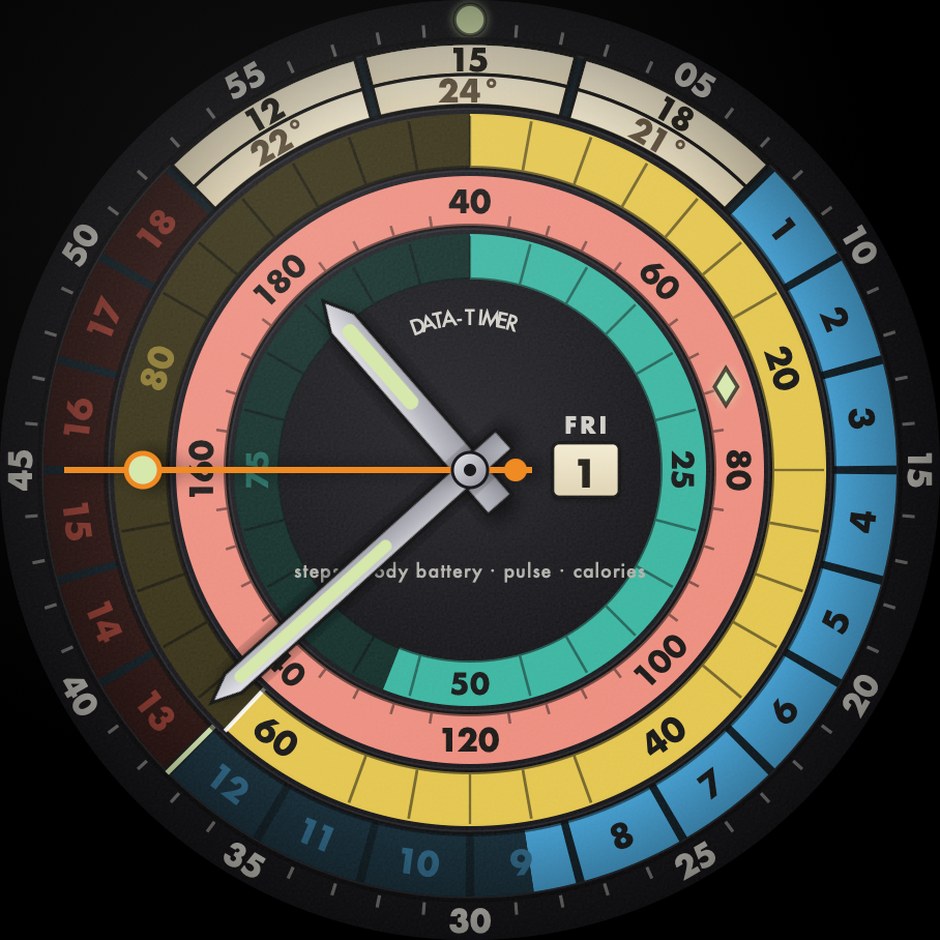
Round three was corrections. Midnight became the lead colourway with the rest kept as a setting. The fan cells had to hold "ONE readable value, not an hour|temp pair", so they became one temperature per column, now, plus three hours, plus six. The DATA-TIMER arc and the four-word legend under the centre "were unreadable even at 454", which is the full width of a Venu 3 screen, so they were removed. A contrast fix from round two had brightened the unlit numerals. They went back to dim, because "the issue was SIZE, not brightness".
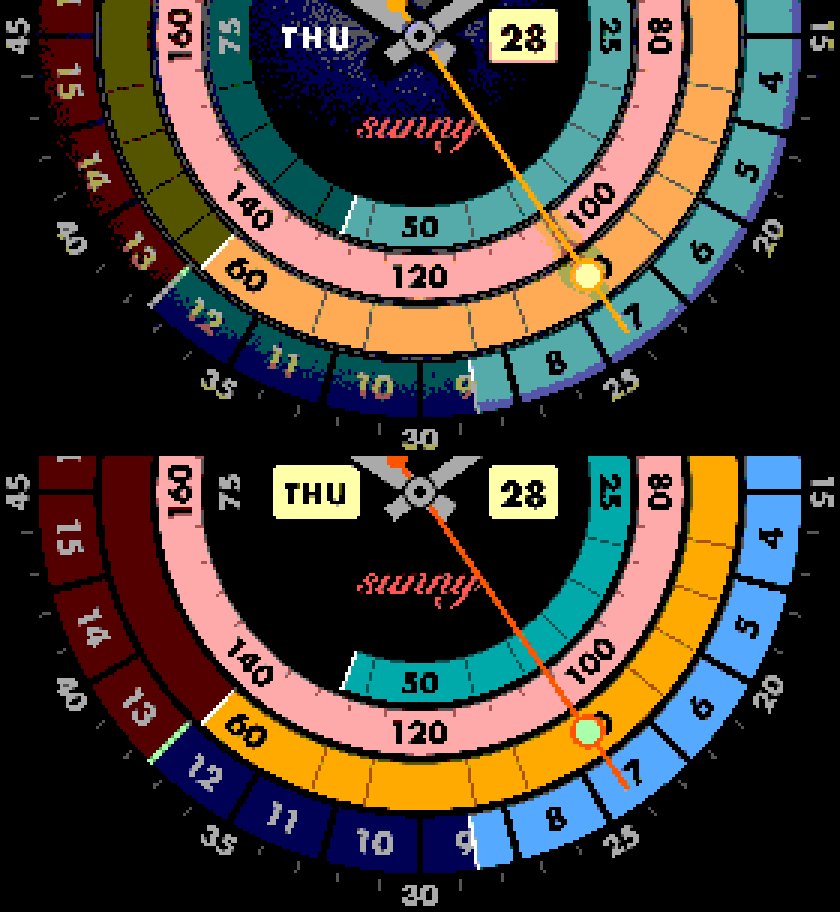
One line in that round changed how I test everything since. I wrote that "plain scaled renders are NOT real device output". I had been judging the design by shrinking a big vector render, which flatters everything. So the concept folder got a simulator. It shrinks each render the way the watch's own screen would, smoothly for the AMOLED models and without smoothing for the ones that draw hard-edged pixels, and for the reflective MIP screens, the sort a fenix Solar has, it cuts the picture down to the 64 colours those panels can show.
On that palette the whole material pass falls apart. The lacquer gradient and the grain have nowhere to land, so the dark centre of the dial breaks into blue and purple speckle, the vignette comes through as visible bands, and Midnight's blue snaps to a teal grey. MIP therefore got its own variant: a flat black dial, no filters at all, and a palette hand-picked from the panel's own colours rather than converted onto them.
Every gauge reads the wearer
The inner ring got its default wrong twice before the face went out, in two different ways.
The first was weekly intensity minutes. It is a real Garmin metric and the ring read it correctly, but you only earn intensity minutes in bouts of ten minutes or more of moderate effort, and the count resets every week. So the ring sat empty for anyone who had not trained yet, and for everybody on a Monday morning. I wore it and wrote: "I have never seen any value there." The reading was right. The metric was zero.
The fix was the watch battery. It always has a value, so the empty ring went away overnight. Every gauge on this dial reads the wearer, and a device reading has no business being the one a buyer sees first. Stress replaced it. Stress is measured all day, it is already a percentage, and it is about the person.
The dial needed one more rule anyway. No reading is not the same as zero. When a source has no data, its ring shows the bare track and no pointer at all. A gauge parked at the bottom of its scale claims the source was read and came back zero, which is false.
The heart-rate zone colours are the one thing on the dial that does not belong to the colourway. Blue, green, amber, red is what Garmin Connect and every training page a wearer has already seen use, and the whole point is reading "zone 4" off the colour alone. Re-tinting them per theme would make the same effort a different colour on Bronze than on Arctic.
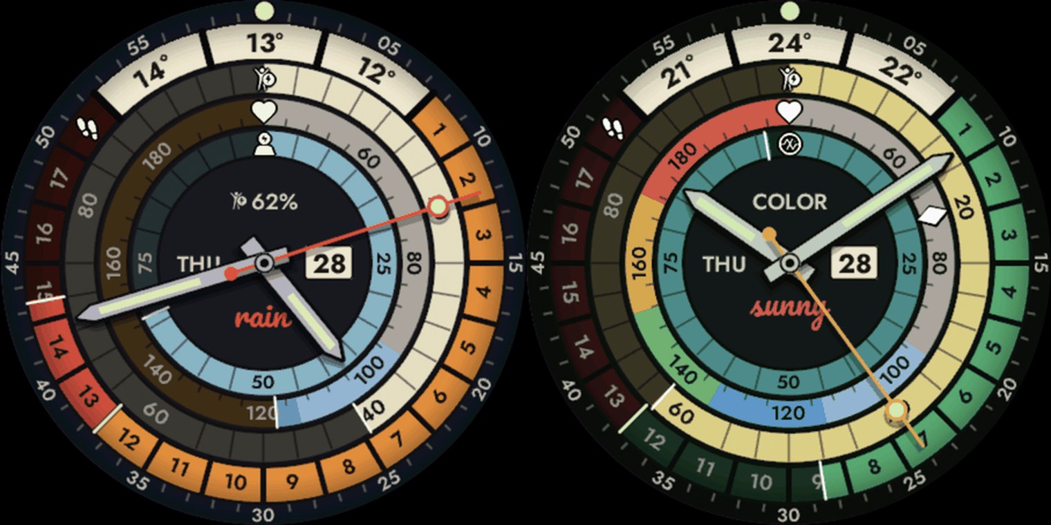
A rejected marketing line made me state one more limit out loud. The first hero tagline claimed the dial showed your whole day. It does not. Only the steps band is a running tally. Body Battery, stress, heart rate and the forecast are all readings of the current minute, and the text had to say so.
Making it look printed
The rotated numerals are a font. Every scale numeral on this dial is a picture of a digit already tilted to the angle it sits at, tinted at draw time, so one set of assets covers the lit ink, the grey and the always-on white, and the whole set is re-cut for all ten screen sizes in one run. That worked for single digits and broke on the forecast temperatures, where a number and its degree sign have to lean together as one word. Turning each character on its own left them off a common line, with the degree sign floating at mid height, so each of those now sits in the font as one whole tilted word.
The cursive weather word under the centre is one glyph per word. Connect IQ cuts each letter's ink off at the edge of the letter's own box, and in a script face the stroke that joins two letters is the ink that crosses that boundary, so the word came out as separate letters with a dark seam at every join. Each word in the vocabulary is baked instead as one whole glyph, rendered once with the typeface's own kerning and drawn in a single call.
The vocabulary itself started at eight words and grew to eighteen: sunny, clear, cloudy, overcast, drizzle, rain, downpour, stormy, snowy, blizzard, sleet, icy, freezing, hail, foggy, hazy, windy, dusty. Eight words had to cover 54 weather codes, so a thunderstorm and a drizzle both came out as "rain". Because the words live in the font rather than in a string, each language needs its own font, and every translated word is the everyday forecast term rather than a translation of the English one.
The vignette is the darkening at the rim that makes the dial read as lacquer under glass. It took seven passes in one day to get the seams out of it. It broke months later, when the minute track, the ring of small marks around the outside, became a setting a wearer could turn off: I had anchored the darkening to the rim of the screen rather than to the dial printed under it, which drained the colour out of the brightest ring on the face, and it is anchored back to the dial now.
Each ring prints a small icon in place of one of its own scale marks, so the dial explains itself without a legend. They all get the same treatment, white ink inside a black keyline. The pulse ring used to print plain dark ink instead, because it never fills and so had one known background colour the whole way round, and that stopped working once the dial had eight colourways: an ink chosen against Midnight's salmon disappears on Platinum's steel.
The seconds hand catches up rather than doing a lap. A full turn on every wrist raise is too much of a performance for something a wearer sees dozens of times a day, so the hand sweeps forward from where it was last drawn to where it belongs now, and a three second gap is barely a twitch. It is capped at a third of the dial, because past that the eye stops reading it as a hand catching up and just sees a hand flailing somewhere random. Past the cap the sweep starts a fixed arc behind the target instead, so every long wake looks the same and still lands on the second.
The wake reveal draws the whole dial once and brightens it under a single translucent layer, so the animation runs at full rate. The first version faded every ring on its own, which meant repainting the dial on every frame, 44 ms of work where the one layer costs 7. The hands draw on top of the layer at full brightness, so the time is readable from the first frame while the dial blooms in behind it.
Always-on
I tried the cheap version first. Dimming the whole active dial under one translucent layer is free and keeps every element. It also measured 10.7% always-on brightness against a limit of roughly 10%, it gets worse as the rings fill, and the dimmed dial reads as grey mud rather than black. I wrote at the time that "we cannot just dim the active mode, it will not look well."
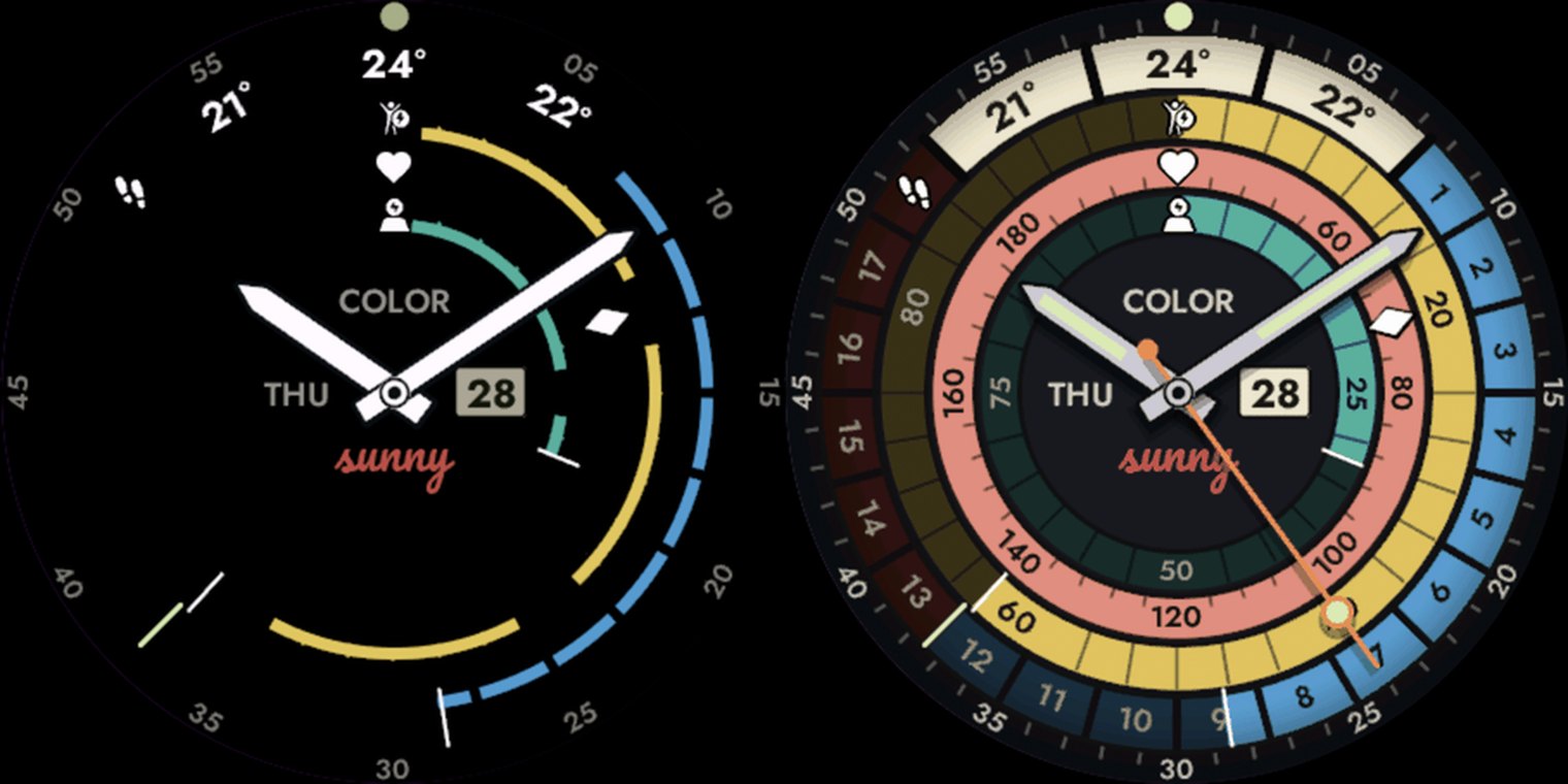
So always-on is drawn as its own scene, a subset of the same dial on a really black background: the printed hour markers, the ring icons, the forecast temperatures and the hands. It measures 7.6% with every gauge maxed, and a half-full dial sits near 4%.
The printed scale numerals stay out of it. They invert between the two modes, dark ink on a lit band by day and white on black at night, and there is no fade between those that reads on the way. The forecast temperatures invert too and are worth keeping, so they switch from white to the dial's dark ink 60% of the way through the wake, by which point the cream cell behind them is bright enough for ink to read.
The plate that said GARMIN
The concept put a maker's plate above the centre of the dial, the way a real watch signs itself, and it copied the inscription off the hardware in front of me. It read GARMIN. That is a trademark I may not print, and I shipped it anyway. It was the default state of the dial, so it was in all nine gallery screenshots and both hero images, and there was a settings option named "GARMIN logo" in all eleven listing languages.
The first submission was declined, with no reason given. It was the only thing this face did that my other faces do not.
The plate reads COLOR now, the name the face is sold under cut to five characters, so it is narrower than the word it replaced and the centre of the dial got no busier. The gallery and the store art were re-shot the same day, overwriting the old files, so there is no surviving picture of the version that was declined. A declined app id stays registered to the declined entry, and the upload form will not take it a second time, so the resubmission went up under a fresh manifest id, which is the app's own identifier inside the file you upload. It was approved.
The name
Deco was the working name and it did not survive the check either. The store already carried a face called exactly that, and a keyword search for it came back as a wall of Art Deco pattern faces, which is the wrong association for an instrument dial and would have buried the listing under decoration.
The other diving names went with it. Decostop is a Czech dive shop, Nitrox names a gas the face has nothing to do with, and the shipped dial kept the 1960s diver's look and none of his subject.
Colorama, Chromatron, Lumitron and Scopitone were all checked for collisions on the store, and Colorama won. It is a genuine period reference, after Kodak's Colorama in Grand Central, with the -ama of Cinerama and Panorama behind it. It names what the gallery is actually selling, and it reads the same in every listing language.
Eight colourways
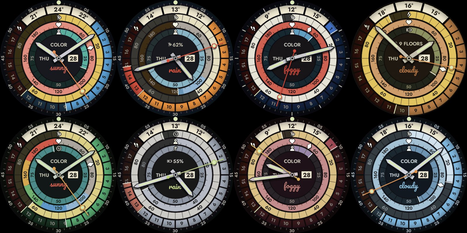
Midnight leads: candy colours on black, which is where the design started. Harbor is the cream and orange on navy from round two. Regatta is the red and blue dive bezel. Platinum is a steel dial with the lume as its only accent. Bronze, Emerald, Bordeaux and Arctic fill out the set.
They are table-driven, so adding one is cheap. The store gallery runs to one shot more than there are colourways, because Midnight appears twice, once lit and once asleep, which is the one comparison a buyer cannot make from a single image.
Colorama on this site, or on the Connect IQ store.
The author builds the My Day 24 watch face family. Published 2026-09-09.